Some online stores sell great, while others fail to engage the audience even if they offer the same product. What’s wrong with web platforms that don’t succeed? The secret of success for each site contains different marketing ingredients, while the recipe for failure is always typical, https://techreport.ngo/ experts explain. Knowing the most popular mistakes will help you avoid them, gain loyal customers, and increase profits from your online business.
Why is the site not selling?
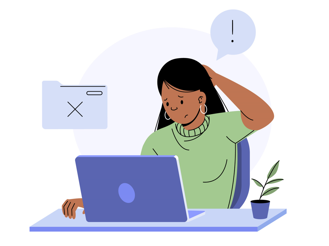
The reasons may be navigation, filling, technical aspects, and lack of organic promotion. That is, the cocktail that creates obstacles also has a different taste. However, marketing research suggests a common set of mistakes that annoy customers and cause them to shop elsewhere instead of you. And the most interesting thing is that these mistakes are elementary to correct quickly.
TOP-5 typical problems of online stores
When a user goes to a tab with an online store, they want to find exactly what they are looking for but spend a minimum amount of time. The consumer also wants to look at the product, read about it, and compare it with similar products. These are the things that bring the online shopping experience closer to the traditional shopping experience. So, what’s stopping your site from selling more?
- Confused site structure;
- No filters for quick and convenient product searches;
- Lack of technical characteristics and description of product features;
- Slow page loading;
- Lack of information about guarantees, methods of payment, and delivery.
Several common issues on websites
Aside from the most common errors and problems that hinder your website from attracting more customers and selling your products or services, there are other pitfalls. Overcome them, and you will see excellent results, measured in the number of clients and the average check size.
- Absence of a mobile version. In recent years, having a mobile-first approach is essential not only for SEO specialists but also for marketers. People find it easier to make orders while relaxing with their phones in hand. However, if your website lacks a mobile-friendly version, you lose a significant portion of your income.
- Complex ordering process. The optimal solution is a one-click order option. This can increase your sales by 17% or even more. Meanwhile, many steps, chaotic information presentation, or the need to make payments on third-party resources reduce user trust levels and increase abandoned carts.
- Using flash technology Instead of HTML5, CSS, and JavaScript, which allows for responsive design, a “Back” button integration, and much faster page loading. These technologies should be preferred over flash.
- Annoying pop-ups. While one pop-up reminder during the entire user interaction with the website is acceptable, bombarding your customers with subscription offers, promotions, or redirects to various products on every new page is annoying and causes users to close the tab quickly. Avoid using aggressive advertising methods without real necessity.
The main mistake is to perceive customers solely as wallets. Respect for your website’s guests should be reflected in the loading speed, design quality, absence of technical errors, and non-aggressive promotional campaigns. Users appreciate such an approach, leading to more orders. Furthermore, they become a loyal audience and advocates of your brand.
Want to see how it works in practice? Turn to elsitech.com to fix typical errors and try new approaches to online business. The results will pleasantly surprise you.
Why are these things so important, and what can you do?
Consumers value their time. That’s why people aren’t willing to wait longer than 10 seconds for a page to load or spend a long time figuring out the structure of your site.
- Make sure you have a web host that provides adequate speed.
- Get rid of the “heavy” pieces of code that cause the problem.
- Add filters that will allow you to sort all products according to significant criteria for the buyer: price, brand, color, size, and other characteristics.
Since your audience does not have the opportunity to take the product off the shelf and twist it in their hands, it is necessary to create informative product cards. Poor-quality product images and inadequate descriptions are typical mistakes. According to Google, only 20% of online stores currently offer interactive product cards so that the buyer can look at it from all sides, read about the product, and get acquainted with reviews or video reviews. Do all this, and your store will be better than another 80% of online sellers.
Don’t skimp on information. Consumers need to understand how to place an order, when it will be delivered, how much it will cost, and other nuances. Try to think of your web platform from the perspective of someone who sees it for the first time and does not yet trust it. Add what is missing – and this investment will turn into great profits.